How to Choose Awesome Paracord Color Combinations
I consider myself to be a creative person. I draw, write, and create things for fun.
One would think that along with being creative, I should have an innate ability to come up with color palettes that are pleasing to the eye. Unfortunately, that is not the case. Color combinations seem to be a bit of a disability for me. I am constantly asking my coworkers about Paracord creations I make: "Does this look fantastic or awful?" (It's rarely in between.)
I am not colorblind in the least, but I often wonder, "What makes a good color combo?" Why can't I add two of my favorite colors together and end up with something that looks great? Why do I think my outfit for the day looks okay when my wife says the colors don't match?
Does Beauty = Science?
Without diving deep into Color Theory 101, there IS a science behind what colors look good together. It's a subjective science, but a science nonetheless.
That is why big companies have pleasant logos while small startups often have painful color combinations. The smaller companies have not hired an expensive designer who's studied and gained experience in mixing colors that play nicely with each other. This is a consistent enough trend that you've probably observed the same.
Color theory often starts with an introduction to the color wheel, along with a system describing why certain color intervals go well with each other. You've maybe heard these terms:
Primary Colors
Red. Blue. Yellow. These are your base colors that are not themselves made up of different colors. Don't ask why. This isn't "Foundations of Design", this is a blog about Paracord.
Secondary Colors
Orange. Green. Purple—er Violet. This is what happens when you mix any two of the three primary colors.
Tertiary Colors
Red-violet, blue-violet, blue-green, yellow-green, red-orange, and yellow-orange. This is one step lower on the mixing pyramid—er, wheel.
Complementary Colors
Colors opposite each other on the color wheel.

Analogous Colors
Colors next to each other on the color wheel.

Triadic Colors
Three colors equidistant from each other on the color wheel.

Square Colors
Four colors evenly spaced around the color wheel.

Split Complementary Colors
Like complementary, but instead of taking a color and its opposite, take the color on either side of the opposite.

Tetradic Colors
Like split complementary, except split both sides instead of just one
Tint vs. Shade

To make a tint of a base color, add any amount of white. (pictured)
To make a shade, add any amount of black.
Warm vs. Cool
Warm colors are red through yellow.
Cool colors are violet through green.
Think cold ocean/snow vs warm sunlight/beach.
Color Symbolism
The world of color symbolism has many opinions and is highly dependent on culture. Colors mean different things to different people.
Red could mean, love, hate, power, or violence depending on the cultural and individual context. Certain kinds of Camo can either represent hunting, or the military.
Color Interference
Just like a good wine might not go with every food, colors can often run interference with each other.
Have you ever seen one of those tricks where you look at a negative image for 30 seconds and then stare at a white wall? The positive colors show up!
Try staring at the "x" in the picture below. While still looking at the x, notice what color takes the place of the disappearing green circles.

This is why complementary colors look so nice together. When you look at a blue object on an orange background, the blue object looks like its negative, which is orange, when your eye wanders over the orange background.
Color Inspiration
Logos
Logos of your favorite brands or sports teams are a great place to look for colors that go well together. Branding is all about grabbing attention and conveying a value or mood, which is very similar to the goal of clothing/jewelry styles.
Nature
Nature is another great place to look for color inspiration. Nature is filled with amazing combinations of subdued colors right alongside bright ones. Neutral tones with a bright highlight have become one of my favorite ways to mix colors.
Color Palette Websites
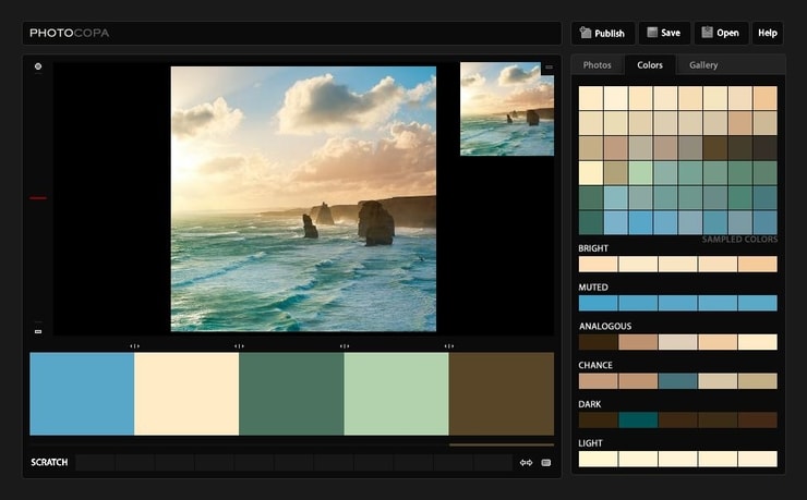
There are many websites that automatically pic colors out of an uploaded picture. Find (or take) a picture with colors you like and try it!
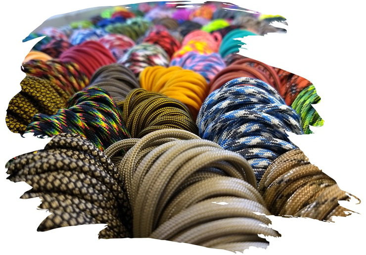
What about Patterns?
You may be thinking, "That's all well and good, but what about using patterns like camo in my Paracord projects?"
Patterns are a little bit trickier for a number of reasons:
- You now need to pay attention to each color in whatever patterns you are using.
- Not only can colors in patterns clash, but the patterns themselves can look not good with each other.
- Patterns obscure the natural pattern of the knots. (This can be good or bad.)
To help you find colors and patterns that go well together, we have put together a variety of kits for making keychains or gun slings. Many of them come with matching buckles and hardware.

Some other suggestions for using patterns:
- Keep pattern use to a minimum. Patterns work best alone or paired with a similar solid color.
- Try using the same pattern in two matching colors.
- Patterns with bigger blotches of fewer colors are more versatile than patterns with 5 different colors in tiny speckles.
Hopefully, this information gives you some valuable tools for creating Paracord creations with awesome colors. If you disagree with any of the information put forward, that's okay!
You will likely find some color combos more appealing than others, because ultimately, beauty is in the eye of the beholder. Make what you think looks good!
But maybe check with the wife before heading out the door in a striped shirt and paisley tie—unless your day job is being a clown.